Creating a seamless and consistent user experience is crucial for web development for small businesses that seek to maximize engagement and conversion. Since the start of access to web material on handheld devices in the early 2010s, consumers have engaged with websites across various devices, from desktops and laptops to smartphones, tablets, and even smartwatches. A responsive website offers a strategic approach to adapting your website seamlessly to any device, ensuring optimal user engagement and maximizing your business reach. This comprehensive guide will equip you with the knowledge to understand the core principles of Responsive Web Design (RWD), its implementation process, and the key benefits and potential drawbacks it presents for businesses. Whether you are a seasoned web developer or a business owner unfamiliar with technical jargon, this guide offers a clear and concise overview of RWD, empowering you to make informed decisions about the web design that ensures a seamless user experience for all your website guests and enhanced online presence to capture a wider audience for your business goals.
WHAT IS A RESPONSIVE WEB DESIGN (RWD)?
Responsive Web Design (RWD) is a modern web design approach that ensures websites automatically adjust and adapt their layout and elements to any screen size, regardless of the device accessing them. This eliminates the need for separate mobile websites and provides a consistent, user-friendly experience across all platforms.
Effective Responsive Web Design (RWD) eliminates the frustrations associated with non-responsive websites. Users no longer encounter cumbersome resizing, excessive scrolling, and tedious zooming or panning to access content. This seamless experience across devices translates to improved user engagement, reduced navigation barriers, and ultimately, higher conversion rates.
By prioritizing user-friendliness and intuitive navigation, RWD creates a positive brand perception and fosters user loyalty. Additionally, eliminating accessibility roadblocks attracts a wider audience, expanding potential customer reach and market share for your business. Here is the summary of the key features of RWD:
- Dynamic adaptation: Website elements and layout automatically adjust to different screen resolutions, accommodating diverse devices without compromising content integrity or requiring excessive user interaction.
- Optimized content delivery: Images and other media elements are dynamically scaled to ensure optimal presentation on various devices and networks.
- Cross-device compatibility: RWD adheres to web standards and best practices, promoting consistent accessibility and functionality across a broad range of devices and browsers.
While dynamic adaptation, optimized content delivery, and cross-device compatibility are the core pillars of RWD, it utilizes a combination of flexible grid layouts, responsive images, and strategic CSS media queries to ensure websites seamlessly adapt to diverse screen sizes and device capabilities.
HOW DOES RESPONSIVE WEB DESIGN WORK?
Responsive web design relies on the strategic utilization of Cascading Style Sheets (CSS) to deliver device-agnostic experiences. Instead of serving a single, fixed layout, RWD employs various CSS settings to dynamically adjust style properties based on a user’s device characteristics. These characteristics can include screen size, orientation, resolution, color capability, and more. This ensures optimal website presentation and functionality regardless of the device used, enabling seamless user experiences across desktops, tablets, and smartphones.
Key CSS properties instrumental in RWD include:
- Viewport: This defines the initial visible area of a web page, allowing developers to optimize content rendering within specific dimensions.
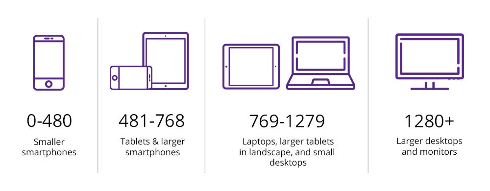
image reference from: https://blog.devgenius.io/understanding-responsive-web-design-and-media-queries-d9c7a143757b
- Media Queries: This enables applying conditional styles based on user device attributes, ensuring targeted website adaptations for distinct screen sizes and capabilities. Here is an example of this:
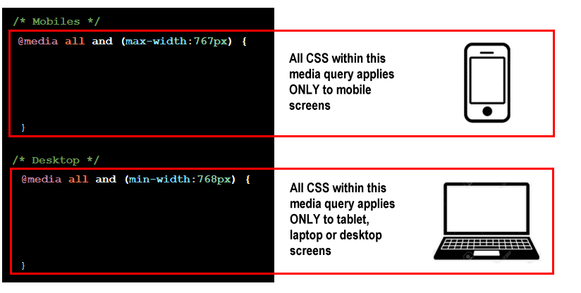
image reference from: https://www.munnelly.com/webdev/responsive-web-design-media-queries.html
The role of media queries
By leveraging media queries, developers can delve deeper, inspecting the user’s device characteristics like screen dimensions, orientation, and even color capabilities. This dynamically alters the website’s design based on specific device properties. Compared to static breakpoints defined in HTML/CSS, this approach delivers a more user-centric experience, tailored to the nuances of each device. Essentially, media queries act as intelligent filters, detecting device dimensions and triggering optimal content rearrangements to provide the best possible user experience regardless of screen size. This, in essence, allows websites to be truly “responsive,” adapting fluidly to a variety of devices and user experiences.
The role of flexible images
Responsive web design demands adaptable visuals that effectively adjust to diverse screen sizes and device capabilities. Flexible images, also known as adaptive images, address this need by removing fixed-size limitations. This versatile approach enables images to resize naturally within their viewports, ensuring optimal presentation across devices. Beyond scalability, flexible images offer other benefits:
- Adaptable Design: With over 8.48 billion unique devices in use, flexible images ensure designs adapt seamlessly to any future device, regardless of size or shape.
- Improved Performance: Lightweight SVG formats are ideal for non-photographic elements like icons, offering scalability without quality loss and contributing to faster loading times.
- Efficient Resource Management: Dynamic image serving delivers device-appropriate resolutions, minimizing data usage and enhancing user experience on bandwidth-limited devices.
- Strategic Use of Visuals: The ability to hide specific images based on user context allows for a focus on critical content, improving information hierarchy and user engagement.
The role of fluid grid/layouts
Fluid or Flexible grids/layouts automatically rearrange content columns based on the user’s device and viewing preferences. They allow website elements to resize and reposition themselves based on screen size, ensuring a visually balanced and consistent layout across all devices.
These adaptive layouts offer several business benefits:
- User-Centric Design: By relinquishing control to user browsing habits, flexible grids empower users to interact with content in a way that suits them best, optimizing user experience across devices.
- Consistency and Efficiency: Maintaining a consistent design aesthetic across devices becomes effortless with flexible grids. This not only fosters brand recognition but also saves time and resources compared to managing separate versions for each device.
- Scalability and Future-Proofing: Grid systems, whether pre-built or custom-defined, ensure that content scales seamlessly regardless of screen size or future device iterations.
- Simplified Maintenance: Flexible grids rely on relative units that eliminate the need for pixel-specific adjustments, streamlining website maintenance and updates.
It is crucial to avoid overreliance on one aspect as the sole pillar of responsive web design. They work best in conjunction with the steady foundation of each other. While careful planning and expertise are crucial for effective RWD implementation, the benefits extend far beyond technical considerations.
WHAT ARE THE KEY BENEFITS OF A RESPONSIVE WEB DESIGN?
Responsive web design offers many advantages for both users and developers. While RWD offers convenience, businesses should evaluate its advantages for a more informed decision before its implementation. Ultimately, the key lies in embracing an approach that is aligned with businesses’ objectives and goals. Let us delve into the key advantages:
Enhanced User Experience (UX)
RWD delivers on this promise by ensuring seamless website interaction regardless of device, fostering inclusivity, and reducing user frustration. Content dynamically adapts to screen size, guaranteeing consistent readability and intuitive navigation, creating a smooth and productive user journey across desktops, tablets, and smartphones. Additionally, RWD-optimized websites often load faster, further enhancing user engagement and contributing to overall business success.
Unified Analytics and Marketing
RWD empowers businesses with comprehensive analytics capabilities, offering a unified view of user behavior across diverse devices. This understanding of device use, encompassing mobile, tablet, and desktop interactions, informs data-driven decisions for strategic online presence optimization. Also, RWD simplifies marketing efforts by consolidating social shares, likes, and inbound links under a single URL, streamlining resource allocation and amplifying overall reach. Additionally, by presenting a consistent design across all devices, RWD strengthens brand recognition and fosters trust, leading to a seamless and positive brand experience that enhances customer loyalty and engagement.
Search Engine Optimization (SEO) Compatibility
RWD offers significant SEO advantages, contributing to improved organic traffic and search engine visibility. Search engines increasingly prioritize mobile-friendly websites, and RWD ensures effective adaptation across devices, enhancing search engine ranking and organic traffic acquisition. Also, RWD simplifies content management by requiring updates only once, eliminating the need for duplicate content creation across various device-specific versions. This not only saves time and resources but also prevents potential SEO concerns for duplicate content. Furthermore, RWD’s flexible design adapts to evolving device formats and screen sizes, safeguarding your website investment and ensuring long-term SEO relevance. This guarantees businesses’ constant online presence and maximizes their reach online.
Operational Efficiency
RWD offers numerous operational efficiency benefits. RWD streamlines website development by eliminating the need for complex redirects and user-agent targeting, leading to reduced development costs and quicker turnaround times. Also, it significantly reduces ongoing maintenance overhead by requiring only one website to be maintained instead of multiple device-specific versions. This minimizes resource allocation and simplifies content updates, freeing up valuable time and effort for other strategic initiatives. Moreover, RWD promotes a consistent user experience across devices by mirroring the desktop site’s information architecture in its mobile iterations. This minimizes the learning curve for users and fosters a sense of familiarity, ultimately contributing to user retention and engagement. By prioritizing operational efficiency through RWD, businesses can optimize their development and maintenance processes, driving cost savings and enhancing overall effectiveness.
WHAT ARE THE DRAWBACKS OF A RESPONSIVE WEB DESIGN?
While responsive web design (RWD) offers compelling advantages for user experience and accessibility, it’s essential to consider potential disadvantages before implementation to have a more balanced look into it. Here are the key challenges businesses might face with RWD:
Performance Considerations
Managing potential load time impact is crucial. Downloads of non-essential HTML/CSS code and scaled-down images, while often minimal, can contribute to slower loading times on mobile devices. Balancing optimal code utilization with visual quality requires targeted optimization. Prioritizing critical content and employing efficient image formats are key to ensuring a smooth user experience regardless of device.
SEO implications
Optimizing for search engines in a responsive design environment requires a nuanced approach. While RWD eases technical SEO concerns, catering to distinct mobile user behavior is crucial. This includes understanding varying keyword preferences and the growing importance of voice search among mobile audiences. Specific content optimization for mobile users might be necessary alongside the technical benefits of RWD. Furthermore, Google’s current indexing practices prioritize desktop content, potentially limiting the impact of mobile-specific content within responsive URLs. Exploring alternative approaches like dynamic content serving or AMP may be required for specific verticals to ensure optimal search visibility across devices.
Development Cost and Time
It is essential to acknowledge associated development complexities. Implementing RWD, particularly for intricate websites, necessitates increased development time and resources compared to traditional approaches. Carefully evaluating this initial investment against long-term maintenance benefits is crucial for informed decision-making. Also, the inherent fluidity of RWD layouts can limit control over intermediate screen size appearances. Establishing clear design guidelines for developers is paramount to ensure consistent brand expression and optimal user experience across diverse devices. Moreover, crafting a unique and brand-specific RWD website can be more challenging than simpler methods. Certain functionalities, like touch gestures, specific layouts, or voice search, might not be readily compatible with RWD, requiring creative solutions or alternative approaches.
While RWD simplifies maintenance in theory, ensuring optimal performance across various devices and browsers necessitates ongoing attention. Thorough testing across relevant browsers, particularly older versions with your target audience, is crucial for compatibility. Additionally, the dynamic nature of RWD requires continued optimization to guarantee peak performance across diverse screen sizes and user expectations. While the initial development cost of RWD can be higher, its long-term maintenance cost reduction potential and ability to reach broader audiences through a single website should be carefully weighed in the overall cost-effectiveness analysis.
Design Collaboration and Approval
RWD’s dynamic nature can necessitate a complex design workflow, particularly when presenting numerous potential layouts across diverse screen sizes. To optimize efficiency, focusing on initial wireframes and core layouts can expedite the approval process for stakeholders. This initial stage can be followed by operational demonstrations showcasing the website’s functionality on various devices, providing a more tangible understanding of the final product. This streamlined approach reduces design time and facilitates smoother collaboration, ultimately leading to a more efficient and effective RWD development process.
WHY SHOULD YOU CONSULT WITH SPEAKCITE FOR A RESPONSIVE WEBSITE DESIGN?
Speakcite, a leading SEO agency in the Philippines, helps businesses configure a responsive web design (RWD) by leveraging valuable insights into its advantages, potential drawbacks, and key implementation factors. This empowers businesses to make informed decisions, ensuring their websites cater to the diverse browsing habits of modern consumers.
Recognizing the diverse needs and budgets of businesses, Speakcite guides clients through various RWD implementation options. Speakcite’s RWD approach takes a strategic and holistic perspective, considering diverse factors for optimal results. We have suitable solutions for complex projects demanding specialized expertise and cost-effective solutions for projects with specific RWD needs.
By carefully evaluating individual needs and resources, Speakcite empowers businesses to harness the full potential of RWD in delivering seamless user experiences and maximizing online presence in the multi-device era. Contact Speakcite today for RWD solutions that fit your business goals.